Research.

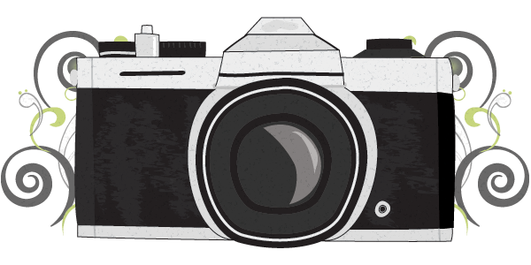
I found this image while researching for magazine double page spread images. I really like the idea of the image covering three quarters of the double page, leaving quarter of the page for writing. I also like the use of a black and white image being use to draw attention, the use of a black and white image means the image has to be striking enough to catch attention without bold colours.

Layout of double page spread.

For my experiment of my double page spread i have used inspirations from the previous florence and the machine double page spread. by laying the page out like this i can plan how much i can write for my double-page spread and how much room i have to work with for my image. although i like the layout of this page i’m unsure as to whether it works well with my other designs, the image is also very diffeicult to fit in the space available.

colour experiment

After choosing where to place my mast head i decided to put a layer filter over my image at a low opacity. By doing this it creates darker and more contrasted colours. I have also decided to use black and white image for my double page spread and use a grey back ground for my contents page therefore this helps to relate to the darker black and grey colouring of this front cover image.

Where shall i put my mast head?

I have tried placing the my mast head at both the top and the bottom of my cover image. I then asked my peer group which image they preffered to get some feed back on which positioning i should continue using for my front cover. Although many of them liked the idea of challenging the normal/average design by placing the mast heads at the bottom of the page it come back that the mass majority of the peer group preffered the placing at the top of the image. Choosing this placing has also worked in my favour, it allows room at the bottom of the page to add a small caption.

My front cover image.

This is the image i have chosen to use for my front cover image. I chose this image because it is centered perfectly on the front cover. The image also shows the model looking straight into the camera and therefore interacting with the readers of the magazine. When ehancing this image  i chose to chance the hair colour to this noticeable red, i did this to create a relationship between the image and the mast head.